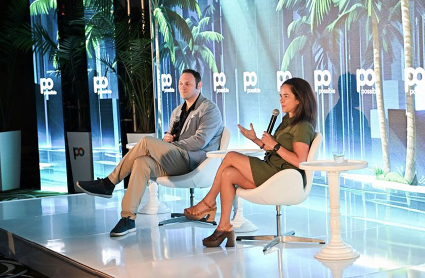
Data

Consumer Expenditure Survey: An economic analysis of transportation spending from 1984-2017

Ben Labaschin · September 13, 2018 · 5 min read
Arity's economic analyst takes a look at the new data from the consumer expenditure survey and provides an analysis of transportation spending from 1984 to 2017

If you haven’t heard, on Tuesday, September 11th, the Bureau of Labor Statistics (BLS) released its annual dose of data on consumer expenditures in the US economy. Consumption accounts for approximately 2/3 of America’s Gross Domestic Product—the metric most people refer to as the barometer of growth, and therefore health, of a national economy. Any release of data on consumption patterns is therefore significant.

As an economic analyst in the transportation industry, this release of data is particularly significant to me. This data is the most up-to-date we have on transportation spending among consumers. So, what does it say?

Let’s start easy.

According to BLS data, in 2017 average before-tax income was down by about 1.5% among consumers—from $74,664 in 2016 to $73,573 in 2017. Meanwhile average annual expenditures were up just under 5%—from $57,311 in 2016 to $60,060.

These results are a bit of a mixed bag: one hopes to see income rise with increased spending. Because we don’t see this in the data, it could mean that consumers feel a bit more confident, despite earning less. More probably though, this increased spending reflects recent patterns of inflation in the US economy—up 2.1% in both 2016 and 2017.

At a rise of 5.8%, transportation spending is up as well. Whereas in 2016 total average transportation expenditures were $9,049, in 2017 average spending among consumers rose to $9,576.

Illustrating the data

It is worth noting that, while easy to do, relying on averages of nationally representative data can be a particularly flawed tactic to use when considering a diverse population such as that of the United States. Due to regional and demographic differences, the potential is high for large outliers in the data, which may raise or lower averages accordingly.

Still, while this is true, averages are useful for illustrating economic trends over time.

Take the above chart, for example. It represents average consumer transportation expenditures over time by income quintile. For those 20% of consumers who earn the least on average (“Lowest” on the chart), we are able to observe that their spending patterns are markedly different than those 20 % of people who earn the most on average (“Highest” on the chart).

This is what we’d expect. The top earners of any economy are likely to spend more money on transportation than those who earn less—Maserati’s have yet to become a casual mode of transportation.

Yet, something is missing in the above chart. If anything, it lacks inspiration. Yes, spending on transportation has risen for all quintiles. And yes, every quintile spends less than the one above it. But where’s the pizzazz? Well, the above data becomes far more fascinating when we weigh average spending on transportation over average money earned overall, like I’ve done in the chart below.

Now we’re getting somewhere. Note that the quintiles in the above chart, which illustrate spending on transportation as a share of earned income, have essentially flipped. Those who earn the least on average tend to spend the most on transportation as a fraction of their income, while the opposite is true for those who earn the most.

Also, notice that since the 1980’s the share of income spent on transportation among our poorest citizens has significantly fallen, from over 60% to under 40%.

Overall this data is far more interesting—it demands our attention—it speaks to us, telling us that on average, our most economically disadvantaged citizens spend over a third of their money on transportation. Talk about significant.

There’s more too. The chart seems to indicate that since 2008 the share of spending on transportation as a portion of income has essentially flattened. Why might this be?

As an economic analyst, the theoretical side of my mind turns to the concept of diminishing marginal returns: there are only so many efficiencies to be added to the transportation process. But as a realist, and a skeptic of easy economic narratives developed in the musty halls of the economic academies, I have my doubts.

Flattened curves and what’s to come.

As far as I’m concerned, there are still more efficiencies to be expected from the transportation industry—especially in the realm of insurance. Just look below at changes in consumer expenditure patterns on vehicle insurance in recent years.

With such large fluctuations, clearly there has been room to afford savings to consumers. And, with the advent of user-based insurance and telematics solutions, I believe we should only expect these savings to increase in coming years. I don’t know about you, but I know I’ll be waiting for next year’s consumer expenditures release to see if these efficiencies continue to emerge in the data.

You Might Also Like

Connected Car

A history of ridesharing: from the jitney to Uber

Rideshare as we know it has been around since 1910 and there is a significant, thematic correspondence between what it was then, and what is it today.
September 2018
7 min read
Connected Car

Is millennial debt fueling rideshare use?

Evidence we have about millennials suggests that their transportation use may have been fueled in large part by the debt they have.
September 2018
12 min read
Connected Car

A call for smart city collaboration and coordination

Gary Hallgren discusses the future of transportation and more specifically how to get jurisdictions to work together to make smart cities a thing.
September 2018
4 min read